First Responder
I had only just recently decided to leave the game industry and return to the web when A List Apart published Ethan Marcotte’s pivotal article, “Responsive Web Design”. Since Ethan is a close friend, I assumed and continue to assume that his landmark discovery was specifically timed to validate my decision with firm authority. This was very, very exciting stuff.
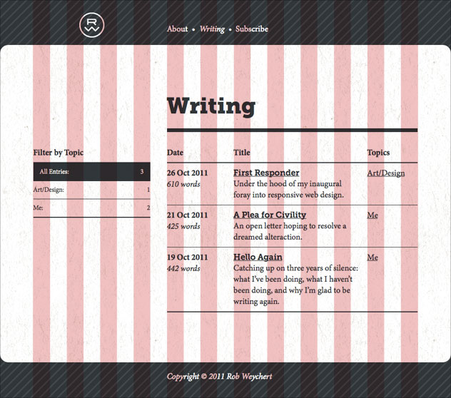
This site is my first full-scale attempt at responsive design. It uses one template for all pages, with built-in modules to support three different content sizes: main (medium), supporting (small), and oversized (large). Since all of those modules accept virtually any type of content (text, images, tables, etc), this template gives me a good variety of layout options right out of the box. However, if it proves too limiting for what I want to do with a particular page, the template’s underlying grid allows for many more possibilities, and with just a few additional lines of code in a page-specific stylesheet, I’m off to the races.
Of course, nothing about the approach I’ve described so far is peculiar to responsive design. The amount of layout versatility this template enjoys is most applicable to a desktop display, a large canvas whose luxurious expanse of screen real estate is growing less relevant with every iPhone sold. To be properly responsive, this thing needs to work well in a variety of screen contexts. Luckily, my grid is designed to scale, and the display of each of the content modules (as well as page-specific styles) can easily be modified within the grid to suit the width of the user’s viewport.
Though my design began with the desktop and scaled down from there, the site is actually built in reverse order, for reasons expertly outlined in Luke Wroblewski’s superb Mobile First. In that order, the diagrams below illustrate what I’ve described above. Please note that while the grid and module widths have their basis in pixels, the widths are not fixed, so the numbers actually represent proportions.


Ask not what ASCII can do for you.
Since responsive design’s fluid nature requires widths to be specified primarily in percentages, and my twitching neuroses demand precision to as many decimal places as possible, my CSS is full of scary-looking numerals. I was careful to add comments explaining where each percentage came from, but the comments still worked best in conjunction with an image. So I decided to recreate the diagrams above as ASCII art and put them right in the CSS file so they would be readily available for my own reference and for the edification of anyone poking around under the site’s hood.
For medium viewports (eight columns):

--------------------------------------------------------
|                         684                          |
--------------------------------------------------------
|    |  |  |  |  |  |  |  |  |  |  |  |  |  |  |  |    |
| 72 |36|  |36|  |36|  |36|  |36|  |36|  |36|  |36| 72 |
|    |  |  |  |  |  |  |  |  |  |  |  |  |  |  |  |    |
--------------------------------------------------------
|    |                    540                     |    |
--------------------------------------------------------
|    |Main (.medium) & Oversized (.large) Content |    |
|    |                (8 Columns)                 |    |
|    |------------------                          |    |
|    |     108      |  |                          |    |
|    |------------------                          |    |
|    |  Supporting  |  |                          |    |
|    |   (.small)   |  |                          |    |
|    |   Content    |  |                          |    |
|    |  (3 Columns  |  |                          |    |
|    |    Inset)    |  |                          |    |
|    |------------------                          |    |
--------------------------------------------------------
Impress your friends!
Now that you know the underlying logic that shapes the pages on this site, I encourage you to regale your friends and family with the details at your next gathering. Bring a projector and laser pointer. They will thank you.